A few months ago Pam Long of Pam Long Photography approached me about doing a joint project. Pam is a wonderfully talented photographer with a studio on Main Street in Historic Ellicott City. She does maternity portraits, newborn or children portraits, family portraits and high school seniors' portraits. Pam wanted to offer a new package option for her clients, having their portrait painted. That's where I come in!
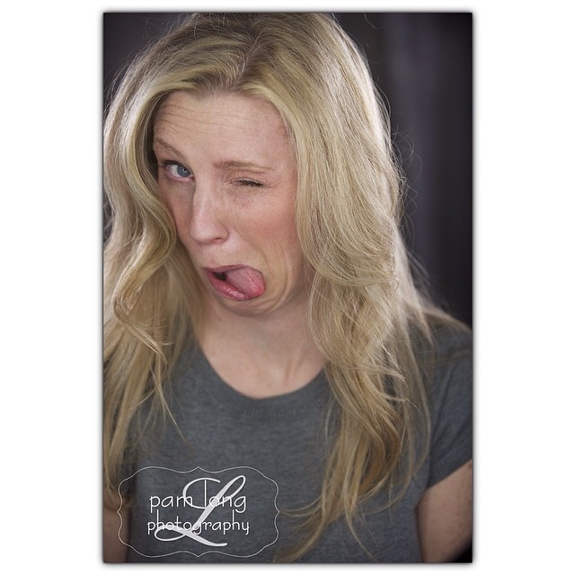
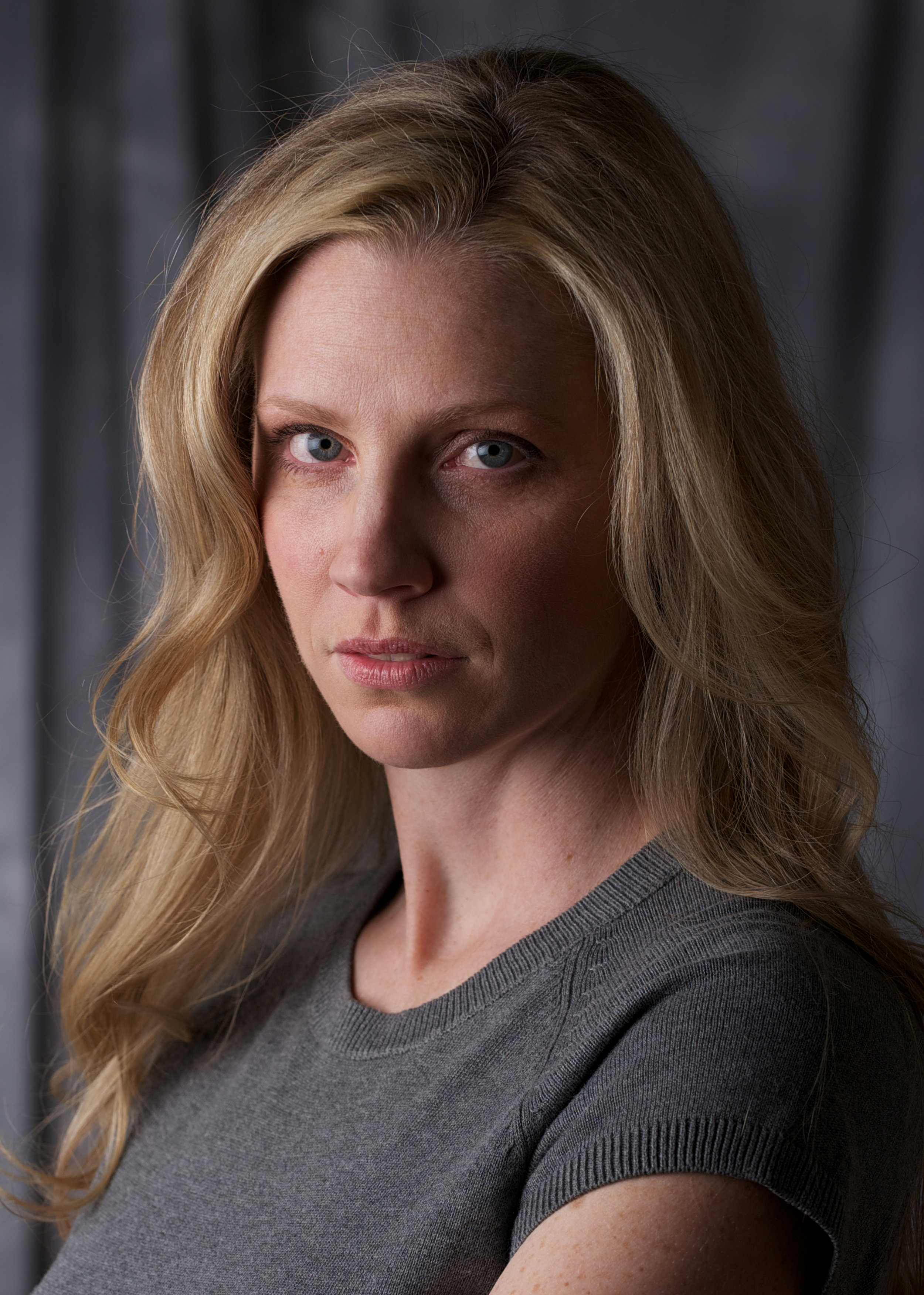
We had a photo session back in February. Ill be honest, I didn't know what to expect since its not every day that I have my photo professionally done. Pam was very welcoming and complimentary, immediately putting me at ease. We had a great time and did a few different set ups. About a week later, I came back to go through the lot and choose a handful that could potentially work for our project. I was surprised at how well they turned out given the subject matter ;) I tend to be goofy and and self conscious when having my picture taken.
With each new painting there is an element of excitement, anxiety, and sometimes fear. Portraits are not easy, especially when they are for a paying client. Careful attention to detail is a must, and sometimes the client will be choosy in how they are portrayed. Remember the whole Kate Middleton portrait kerfuffle? I thought the work was stunning and captured her essence, but most people wanted an idealized image that they had conceived in their minds. You can't please everyone, but you must please the client! In this case the client is me. And its super hard!!
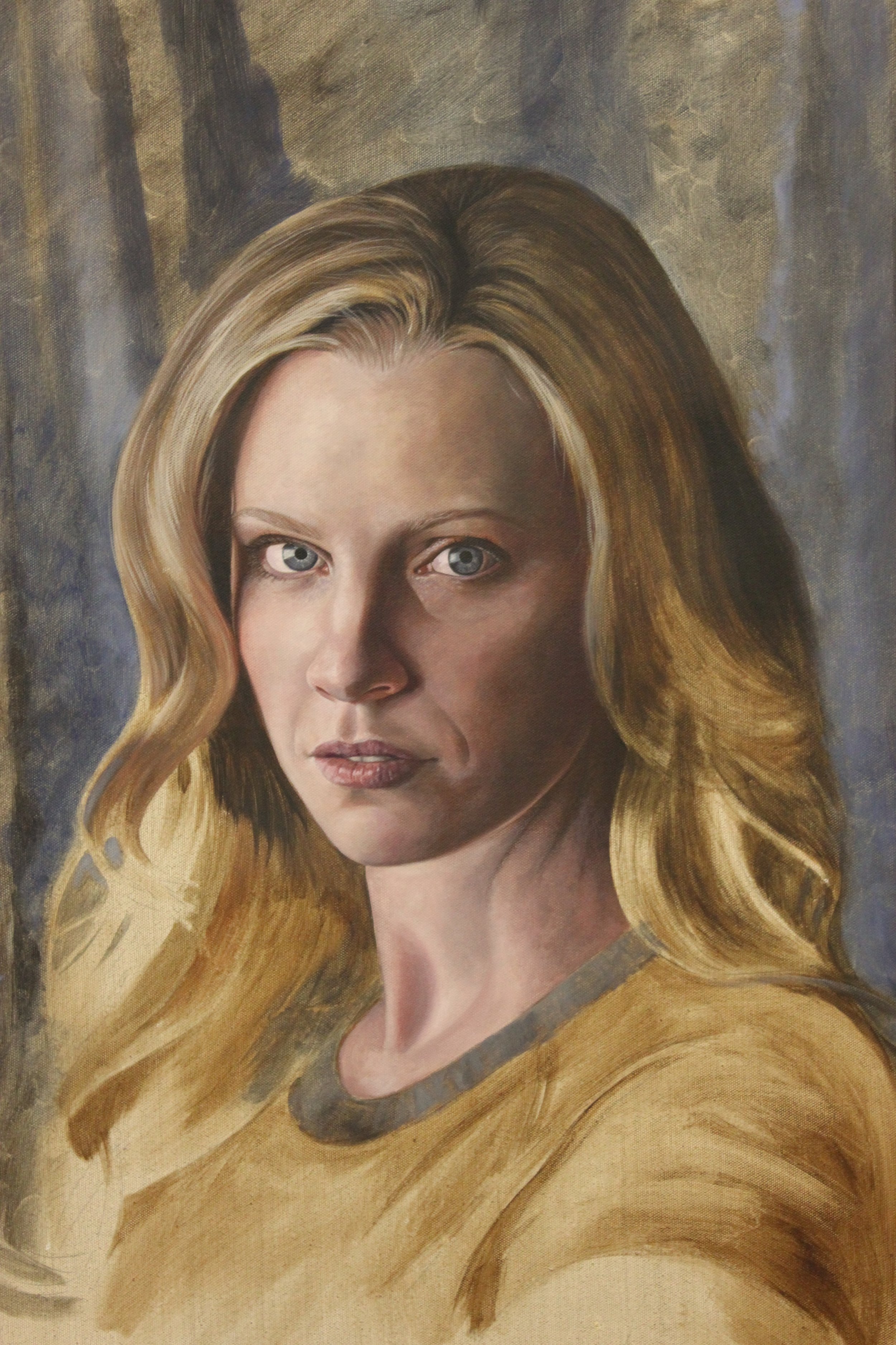
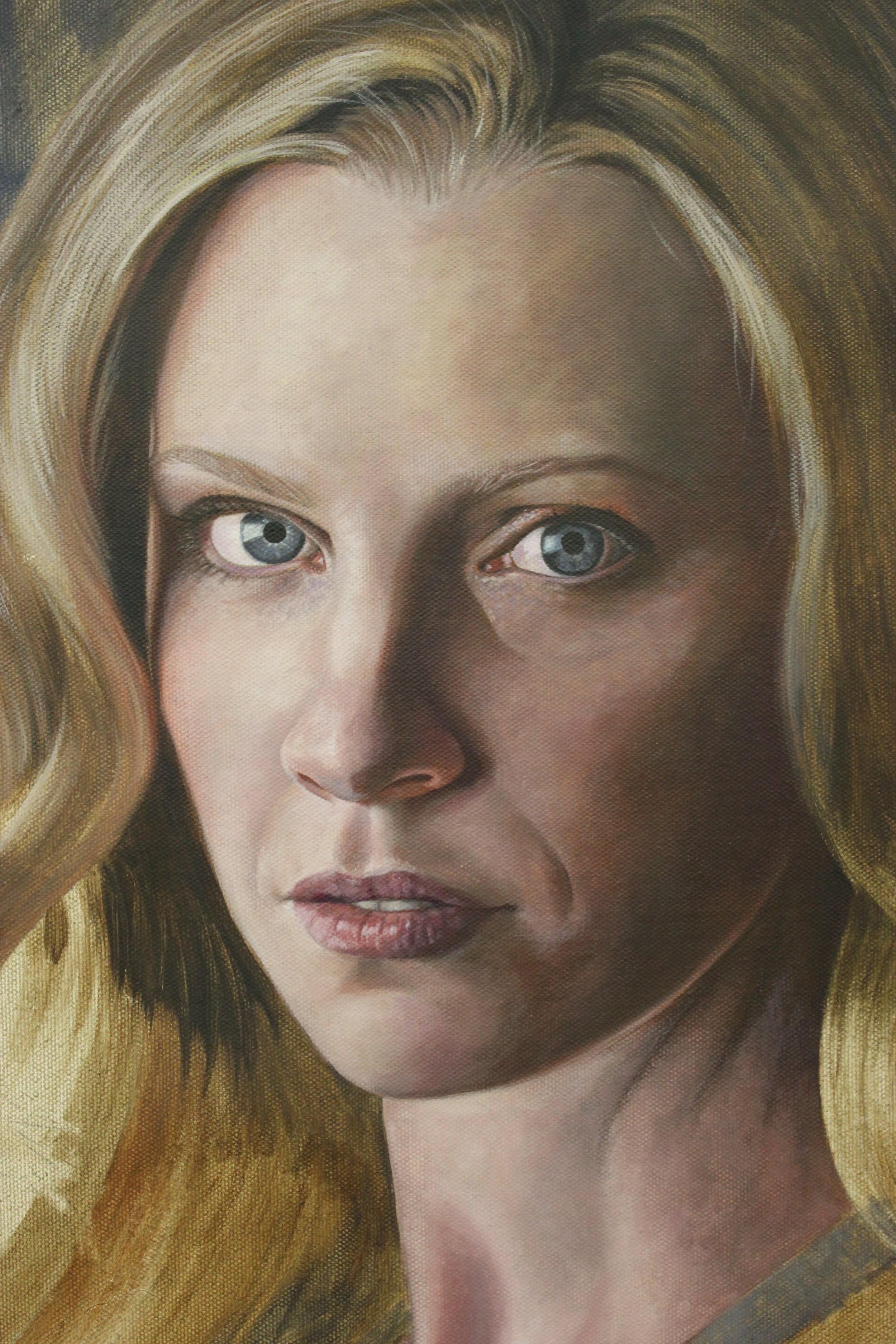
I've always painted in acrylic and this time I've been using my usual standard, Proceed Slow Dry Fluid Acrylics. I did use a different kind of canvas since I was out of the kind I normally use. Somehow I think the combination isn't working very well. I find it difficult to build layers without cutting through the subsequent layers. I also am finding that for this particular project that the paints are drying to opaquely and flat.
What I've been noticing now that I'm working on this is how in other artists' portrait work the colors of the skin are so varied and deep. Cerulean blues, cadmium reds, all layered to achieve such a beautiful luminosity. I tend to mix a color, add white and either burnt umber or raw umber to it to get the value correct, and put it down. The results are very opaque. I am struggling to find how to layer the colors to achieve that beautiful depth. I did some thinking and believe that I am going to try out oils. I've never been properly schooled in their use, but I have used them in the past. I'm hoping that by using oils I'll be able to achieve the subtle nuances with the shadows and richness of the skin.
Ill post some more photos when I think its nearing completion. Any advice or constructive critique is welcomed.
Stay tuned!